Essays by Edith Devaney, Erin C. Monroe, and Marla Price; interview by Waqas Wajaha; chronology by Isabella Boorman. Royal Academy of Arts, London, 2021. 150 pages. 20 figures, 70 plates. Exhibition venues: Modern Art Museum of Fort Worth, November 7, 2021-January 30, 2022. Wadsworth Atheneum Museum of Art, Hartford, February 24-June 5, 2022. Royal Academy of Arts, London, July16-October 16, 2022.
Reviewed by James Leggio
Like many of my generation, I owe my introduction to the art of Milton Avery to Barbara Haskell. In 1982, as a lowly entry-level copyeditor at the Whitney Museum of American Art, I helped in a small way to prepare the catalogue of Haskell’s enormous Avery retrospective for press. Now, forty years later, contributors to this new volume from the Royal Academy of Arts still refer back to it.
Notably, Marla Price praises Haskell’s catalogue for promoting study of the previously little-known early work, and thereby offering a healthy corrective to some of the not-fully-informed initial criticism of Avery.
Fulfilling the academic truism that “The purpose of scholarship is to overturn previous scholarship,” however, contributor Erin C. Munroe of the Wadsworth Atheneum Museum of Art faults Haskell precisely for her treatment of his early years, in Hartford, Connecticut. One sentence in Munroe’s essay reads:
In contrast to Barbara Haskell’s view that Avery and his fellow students were only aware of artwork “heralded by local luminaries” and were “totally ignorant of European modernism,” there was an awareness of art-world trends and happenings outside the region.
The words quoted — “local luminaries” and, even more, “totally ignorant” — may sting, even now, to a present-day representative of the distinguished Wadsworth Atheneum, an important early proponent of modern art in America. And it’s possible, I must admit in retrospect, that this passage in Haskell’s manuscript could have been more sensitively edited and put into less absolute terms (such as, however cosmetically, rephrasing it to say “as yet unacquainted with European modernism”).
•
The continuing engagement with a book published forty years ago may, among other things, suggest that subsequent Avery criticism did not always advance quite as much as one might have hoped during the intervening decades. It seems as if we’re often still rearguing many of the same old issues. One of them concerns the artist’s early work, as relitigated in our opening examples.
Another, and more important, debate involves his much-discussed relations to two other modern masters — Henri Matisse and Mark Rothko — around which key arguments about Avery continue to revolve.
In establishing the case for Avery’s unique gifts, as she ranged widely over his work, Haskell included a balanced view of his kinships with these two artists. Here are two brief excerpts from different sections of her book:
As Avery’s work developed through the thirties, he came to focus not on Matisse’s compositional modes, but on his exploitation of arbitrary color — a characteristic which would become the mainstay of his art. . . . Essentially, Matisse’s example gave Avery license to extend the concerns he was already pursuing. . . .
Of the two currents of Abstract Expressionism, Avery had been the forerunner of chromatic abstraction. For Rothko, Newman, and Gottlieb, Avery’s paintings had provided a model for the expressive possibilities of color. But by 1950 the painters loosely grouped under the rubric of Abstract Expressionism overshadowed everything else, including Avery.
Haskell, it can be noted, keeps the two discussions firmly separate and independent from each other. Matisse-stuff is one thing, Rothko-stuff is quite another.
Yet Hilton Kramer’s review of her 1982 Avery retrospective, while full of praise for the artist, runs these two very different matters together, in order to construct from them a single overarching career narrative whose beginning is Matisse and whose ending is Rothko.
Avery had the finest eye for color in the entire history of American painting. His only rivals in this respect are to be found among the great French modernists — specifically Henri Matisse, whose work exerted a marked influence on Avery’s, and Pierre Bonnard. Like these French masters, Avery combined his interest in color with an easy, instantly legible subject matter. In the age of abstraction he therefore tended to look old-fashioned to eyes that could appreciate the power of color in painting only if it was confined, as it was in Rothko and the painters of the 1960’s Color Field school, to [a] purely abstract image.
Out of Avery’s affinities with two very different artists, the critic’s synthesizing imagination has spun a single career arc, which is now the standing orthodoxy.
It is the orthodoxy repeated in the sub-headline of the Washington Post’s review of the present Avery exhibition:
America’s most original colorist, the subject of new retrospective at the Wadsworth Atheneum, was inspired by Matisse, and in turn inspired Rothko.
•
Where does this daisy-chain of influence (“was inspired by Matisse, and in turn inspired Rothko”) leave us, as we try to understand Avery’s work directly, on its own terms — rather than indirectly, according to who may have helped stimulate it, or who was in turn encouraged by it?
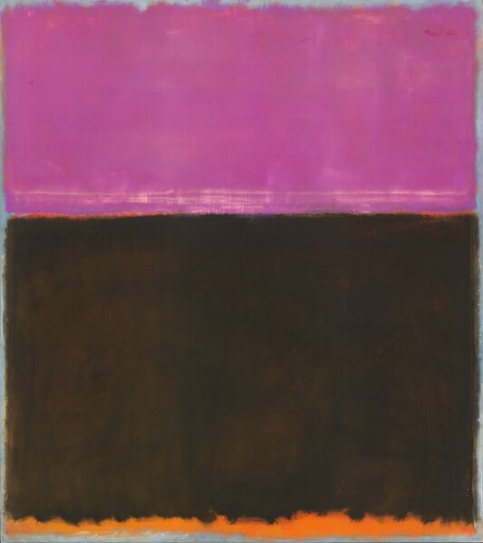
One of Avery’s most Rothko-adjacent paintings, Tangerine Moon and Wine-Dark Sea, conspicuously deploys the Homeric epithet “wine-dark sea” in its title. Recall that in one episode of the Odyssey, the hero had to steer a precariously balanced course between Scylla and Charybdis, the two great dangers, lying only an arrow-shot apart, on either side of the Strait of Messina.
I mention this because, to me, Henri Matisse and Mark Rothko are the Scylla and Charybdis of Avery studies. They are the two defining, orthodox — and sometimes misleading — artist-comparisons that endanger our secure passage through the artist’s work.
Let’s first navigate the Matisse side of the Strait. And then we’ll turn to Rothko.
“The American Fauve”
As Marla Price points out, “Comparisons between Milton Avery and Henri Matisse have been a staple of Avery criticism since the 1940s, with most writers arguing in favour of Matisse’s influence on Avery, some fifteen years his junior.” A little later, she brings in Avery’s own view:
Avery himself had little to say about Matisse’s influence on his painting. In fact only two comments are recorded. A 1952 profile in Art Digest quotes Avery commenting on Matisse: “I like the way he puts the paint on.” In 1961, in an article entitled “He Paints Like Matisse” in the Worcester Sunday Telegram, Avery observed: “Some critics like to pin Matisse on me . . . but I don’t think he has influenced my work.”
Parsing the difference between “like” and “influenced” can be tricky.
It is true that Avery’s obituary in the New York Herald Tribune (January 4, 1965) referred to him as “the American Fauve,” since by then that tag had long been a cliché. Nonetheless, the catalogue for Avery’s retrospective at the Phillips Memorial Gallery, in Washington, D.C., back in 1943, when the Matisse comparison was on the rise, had been at pains to refute any such Fauve claim:
New York critics have attempted to pigeon-hole Milton Avery as “the American Fauve.”. . . We ourselves see no cause to classify Avery as an American Fauve; his metamorphosis of experience into broad clear shapes of color appears to have a quite different starting point and to arrive at a far different result. . . . The color relations and contrasts are not smashing in their intensity; they are more often sensitive and subtle. Gentleness and quiet humor give grace to the boldness of the simplification and the reformation of the object.
Yet despite sensible arguments going back to the Washington retrospective, the Fauve comparison keeps resurfacing: a 2021 auction catalogue repeats the received view of “the American Fauve” — enlisting another article by Hilton Kramer, from 1981, to make its point:
In Tree by the Sea, Avery breaks the composition into four discrete bands: a textured white sky is separated from a blue ocean, which is then further juxtaposed with a sandy dune and the foreground. Seated in the left foreground is the titular tree, leaning off the composition. The multiple horizon lines used here replace the slanted diagonals used in Avery’s earlier works, resulting in a balanced and harmonious composition. In this work, his palette is restricted to cool blues, creamy whites and pastel yellows, another stark contrast from the moodier tones used in paintings from decades prior. No matter what palette was used, however, it was the artist’s unique ability to define composition purely by color rather than line and form that has solidified his reputation as “the American Fauve.” Indeed, Avery’s compositions of the Eastern coastline recall the same use of color blocking and patterned paint application employed in some of Henri Matisse’s depictions of the South of France, as in La Moulade, 1905. As Hilton Kramer eloquently espoused, Avery was “without question, our greatest colorist. . . . Among his European contemporaries, only Matisse — to whose art he owed much, of course — produced a greater achievement in this respect.”
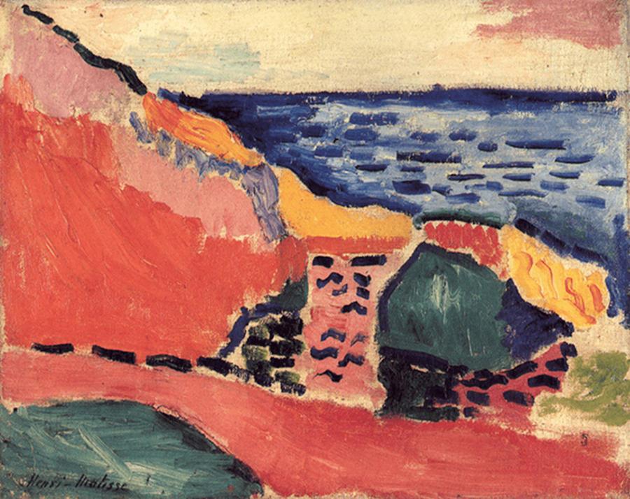
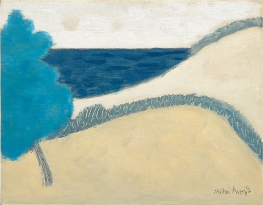
When you look at the two paintings linked together in the sales catalogue, however, certain objections suggest themselves. To many, what’s striking about this comparison is how much Avery, the master of color, does not, after all, really look so very Fauve. Despite the compositional similarities between these two paintings, Avery’s color choices and harmonies are far, far different from Matisse’s. The French painter is intoxicated at this point in his career by shockingly vivid, “savage” color contrasts; the Fauves weren’t called “wild beasts” for nothing. The American, however, in sharp distinction, here favors a muted, placid palette, with large areas of sandy beige and cloudy sky to calm the intensity of the blues. His distinctive zone of arbitrary color is a turquoise tree, whereas the Fauves favored dislocating our expectations of associative color by unleashing a rampage of reds. It looks like the 1943 exhibition catalogue was right after all.
This is not to deny, of course, that Avery in fact learned a lot from Matisse (who didn’t?). It’s just that by the late date of this painting, 1958, Avery had long since developed his own unmistakable palette, at a far remove from Matisse’s. The sales catalogue’s eagerness to make the Avery painting at auction sound as much like a Fauve-era Matisse as possible tends to skew our understanding. The marketing allure of les fauves distracts us from Avery’s individual way with color, as achieved especially in the last great efflorescence of his career as an artist. And it constrains Matisse as well, limiting him to the few short years of the Fauve “era.”
•
In the present book, in contrast, Marla Price’s essay, “Avery and Matisse,” shows how illuminating a properly conducted comparison can be. Here she distills the influence on Avery’s works from the 1930s:
His technique changed. . . . He abandoned the active surface, Impressionist brushwork and New England’s blue-green palette, favouring broader, flat, thinly painted areas of close-valued darker hues with occasional pops of accent colour, such as the lady’s orange hat in The Auction (c. 1930). It is at this point, in the late 1920s and early 1930s, that most scholars feel Matisse’s influence on Avery emerges. After joining the Valentine Gallery (which was also Matisse’s gallery) in 1935, Avery would certainly have had greater access to the Frenchman’s work. His large output of watercolours and gouaches at this time probably also led him to a thinner, more fluid application in oil, similar to that of Matisse.
From Matisse, too, he absorbed the idea that blocks of colour could define composition and depth within a painting.
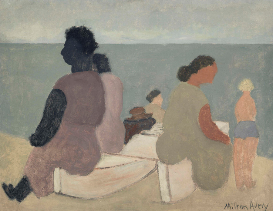
Price offers a particular figures-in-a-landscape composition to demonstrate in detail how to go about comparing the two artists, while emphasizing the growing independence of “Avery’s own palette” and “his own style”:
Sitters by the Sea (1933), one of Avery’s best-known early works, is a demonstration of the lessons he had learned from Matisse, rendered in his own style. Three bands of colour define sand, sea and sky, a device Avery was to use often throughout the remainder of his career. Four female figures sit on a catamaran on the beach and a young blond boy stands off to the right. Tonal complexity is achieved by mixing the colours of individual elements and/or adding white to vary the intensity of hue. The entire composition is based on the interrelationship of colour areas — the only lines in the painting are those that outline the boat upon which the figures sit. Here Matisse’s lessons about the potential of colour to define and carry a composition are executed in Avery’s own palette.
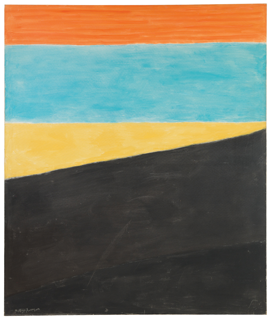
Price’s essay deserves quoting at length because it goes a long way toward sorting out the true nature of Matisse’s sometime influence — and Avery’s eventual moves beyond it, to his own unique vision, culminating in Provincetown seascapes such as Sea Grasses and Blue Sea.
She makes the direction in which Avery moved abundantly clear in her discussion of the critic Clement Greenberg’s change of heart about the artist:
Avery’s great paintings of 1957 and 1958 had a positive, unintended consequence: the conversion of Clement Greenberg. Writing in 1958, Greenberg observed: “There are certain seascapes Avery painted in Provincetown in the summers of 1957 and 1958 that I would expect to stand out in Paris, or Rome or London just as much as they do in New York.” Referring to his earlier negative review of Avery from 1943, he wrote: “. . . if I failed to discern how much there was in these that was not Matisse, it was not only because of my own imperceptiveness, but also because the artist himself had contrived not to call enough attention to it.”
(The Provincetown seascapes are well documented in E.A. Carmean Jr. et al., Coming to Light: Avery, Gottlieb, Rothko — Provincetown Summers, 1957-1961, published by Knoedler & Company, 2002.)
But while Greenberg’s “conversion” — in response in part to “how much there was in these that was not Matisse” — to some extent finally helped get Avery studies past the Scylla of Matisse, it also raised a new challenge. For with the growing admiration of his extraordinary seascapes of Provincetown, Avery was now drawn inexorably toward the Charybdis of Mark Rothko. Ironically, Avery’s arrival at a mature new style all his own would almost come to be seen as, so to speak, derivative “in advance” — that is, perceived by some to be of interest primarily as a precursor to Rothko’s defining achievement.
Sometime roughly between the publication of Greenberg’s conversion review, in 1958, and a quite different landmark text, published by Robert Rosenblum in 1961, the tectonic plates shifted beneath Avery’s reputation.
“The Abstract Sublime”
Rosenblum’s influential essay “The Abstract Sublime” came out in the February 1961 issue of ARTnews. Later, amplifying its theme in his book Modern Painting and the Northern Romantic Tradition: Friedrich to Rothko (Harper & Row, 1975), he began the first chapter this way:
The alpha and omega of this eccentric Northern route that will run the gamut of the history of modern painting without stopping in Paris may be located in two works: Caspar David Friedrich’s Monk by the Sea, a picture whose seeming emptiness bewildered spectators when it was first exhibited at the Berlin Academy in the autumn of 1810; and a characteristic Mark Rothko of the 1950s, whose image of something near to nothingness was equally disconcerting to its first audiences. . . . Does this imply that there may be a true connection between Friedrich and Rothko, that the similarity of their formal structure is the result of a similarity of feeling and intention, and that there may even be a tradition in modern painting that could bridge the century and a half that separates them?
On the opening spread of the chapter, he juxtaposed those two paintings on facing pages:
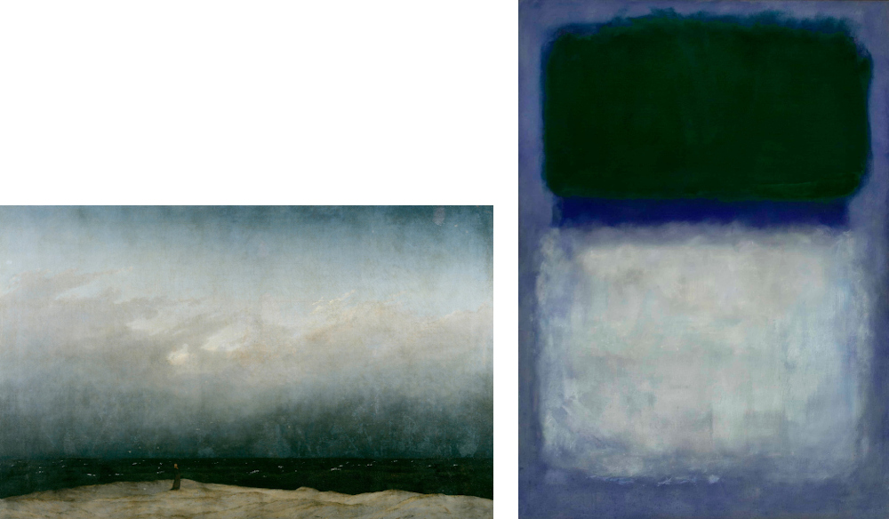
This remains among the most intriguing, and sometimes controversial, comparisons in the literature on modern painting, whether or not you agree that, by the end of the book, Rosenblum did indeed establish what he called “a true connection” between Friedrich and Rothko.
But where was Avery in all this? He’s not even mentioned in Modern Painting and the Northern Romantic Tradition.
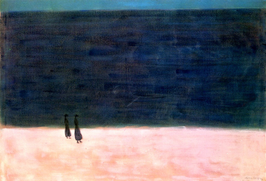
In 1998, I was lucky enough to assist Rosenblum for a time in preparing an anthology of his critical articles, including “The Abstract Sublime,” a volume that was to be published the next year as On Modern American Art: Selected Essays (Abrams, 1999). One day, during a casual editorial session with Rosenblum, having brought into the office my copy of Modern Painting and the Northern Romantic Tradition, I opened it to the spread with the facing Friedrich and Rothko images. Then I brought out my copy of Haskell’s Milton Avery book, opened it to the painting Walkers by the Sea, with its surprising similarity to Friedrich’s Monk by the Sea, and asked him whether it might be Avery, after all, who was the “true connection” between Friedrich and Rothko.
Rosenblum, as you might expect, had already been there. One of the most recent pieces he wanted to include in the anthology was his Artforum article “My Life with Rothko,” published that same year, where he wrote:
And moving into the 1940s, weren’t Milton Avery’s reductive seascapes related to both this [Luminist] tradition and Rothko’s own work (as he himself avowed in his 1965 elegy for Avery)?
Avery’s seascapes were thus acknowledged as having had their part in the Abstract Sublime enterprise from the 1940s onward, though not officially inducted until much later on.
•
By then, it may have been too late. A lot had changed between 1961, the year of “The Abstract Sublime,” and 1998, when Rosenblum returned to Rothko in the Artforum piece. Though Rothko was still recognized, in the years after his death in 1970, as one of the supreme colorists among modern painters, his standing, as with other figures of his generation, had been suffering for some time from the slow, steady deflation of Abstract Expressionism’s philosophical pretensions.
For example, in an unsparing review of James E.B. Breslin’s Mark Rothko: A Biography (University of Chicago Press, 1993), Evelyn Toynton seemed to see a reputational bubble that had long been leaking air. After the opening of his Museum of Modern Art retrospective in 1961, the artist had awakened a friend at 5 a.m. to declare: “I’m in despair . . . because everyone can see what a fraud I am.” The review continues:
Of course, such an outburst was a sign of Rothko’s insecurity, not an objective critical judgment. But Breslin’s absolute acceptance of the received wisdom about Rothko — he is one of the greats, he is the ultimate religious painter of the 20th century — means that he never undertakes the work of questioning Rothko’s achievement as it needs to be questioned. In the end, are those glowing rectangles of color indisputably great works of art — or are they in fact more lyrical than metaphysical, more decorative than Breslin can bring himself to acknowledge? Is the insistent repetitiveness of Rothko’s work a token of the grandeur of his obsession, or the hallmark of a bankrupt imagination? Why keep painting the same painting, the same empty rectangle, over and over?
Given Rothko’s tragic death by suicide, this is hard to read — not only, sadly, for Rothko’s sake, of course, but also to some extent for Avery’s. By the time Avery was publicly, formally, and critically acknowledged as kin to Abstract Expressionism’s color-field wing, the group was losing its cachet. He got that recognition just in time to be considered the precursor to a fading star.
•
Of course nowadays, meaning since the 1982 Avery retrospective at the Whitney, we’re more likely to see him as a figure more fully independent of Rothko, even though some connections remain.
To close out the Rothko discussion, let me quote Hilton Kramer again, this time in his Introduction to Robert Hobbs’s Milton Avery (Hudson Hills Press, 1990). There he lays to rest the question of the younger painter’s influence and argues for Avery as the better artist:
It has been said — by Barbara Haskell, among others — that Avery’s decision in these late paintings to adopt a larger scale and to further simplify his forms in the direction of abstraction may have reflected the influence of Mark Rothko and other painters of the Color Field School. Well, Rothko was an old friend who had looked to Avery for guidance in his younger days, and Avery was certainly aware of what was going on in the art of his time. Yet these last paintings by Avery are, in my view, a more impressive achievement than Rothko’s, for they encompass a far greater range of experience and bring to it a subtler and more varied pictorial vocabulary. I believe they are among the greatest paintings ever produced by an American artist.
Here, we’re at another twist in the Avery/Rothko story: just who, after all, was influencing whom? As the poet says, “The child is father of the man.”
•
Even considering Avery’s “greater range of experience” and “more varied pictorial vocabulary,” I can’t help but recall that, in addition, he also enjoyed the benefits of a sly sense of humor (a point developed by Robert Hobbs). Thus, in pictorial terms, when Avery chose to keep the figure in the picture in a number of his “reductive seascapes,” he sometimes did it with deft humor, thereby distancing himself from the deep solemnity of what he called “the abstract boys.”
Marla Price refers to Avery’s “wonderful visual wit,” which began to emerge in the 1930s. In a notable instance from the 1940s, a bright red beach umbrella (and its two sunbathers) perturbs a luminously lyrical — and otherwise largely abstracted — composition:
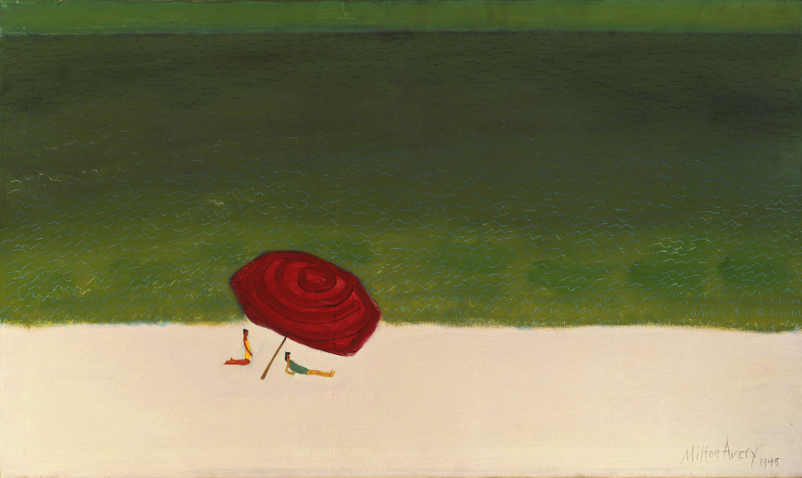
Here, though, what may be most remarkable is not so much the retention of recognizable objects, but rather the punchy concentration of crimson in a tightly restricted zone, the red appearing almost like a rose blossom affixed to the surface. (I wonder whether Avery’s compositional wit is what led Barnett Newman to purchase this painting.)
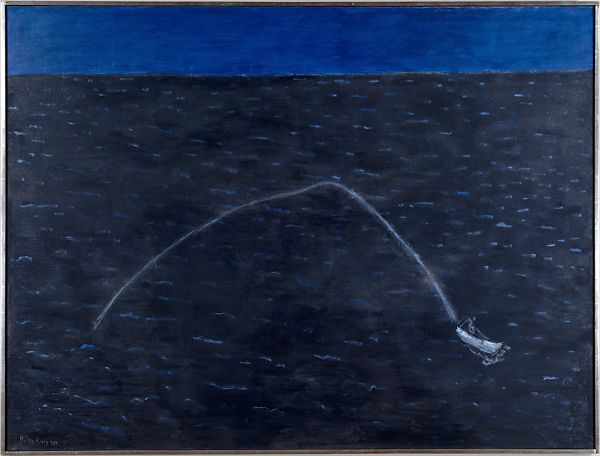
Something comparable happens with the restricted figurative elements in Speedboat’s Wake. Onto the variegated surface of what may at first glance seem like a virtually nonobjective composition, lightly dappled with enlivening daubs of white, the artist inscribes the elegant, twisting curve of the boat’s wake. What would make a sublime Romantic seascape even better? Apparently, somebody jockeying an errant motorboat.
Even at his seemingly most abstract, certain inviting hide-and-seek human elements come into play. In Boathouse by the Sea, where is the boathouse? We see bright, horizontal bands of sky, sea, and sand. Yet within the dark, diagonal shadow cast by the offstage boathouse, the contours of what may be an even darker figure can just barely be discerned. Perhaps here is an oblique precursor to the subtle interplay of very-dark-versus-even-darker forms within Ad Reinhardt’s celebrated Black paintings, first exhibited in 1963.
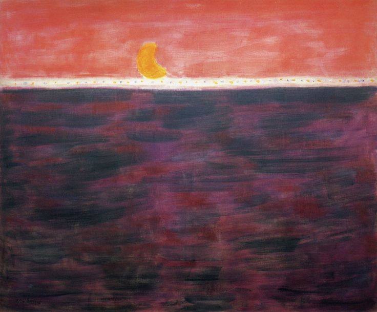
Avery remained affectionately attached to the tangible things of this world. In Tangerine Moon and Wine-Dark Sea, even without the title we’d recognize, on the horizon, the gibbous moon — a deliciously curvilinear form that is also, in shape and color, apparently a juicy section extracted from a ripe tangerine fruit. Without the gravitational pull of the moon, the richly wine-dark horizontal band would be, essentially, just an attractively articulated color field.
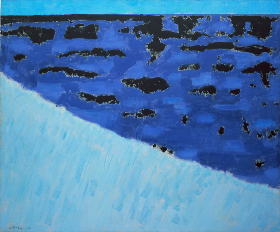
Speaking of the sea, scroll back to Sea Grasses and Blue Sea, reproduced earlier. In such a painting, Avery’s ability to evoke, through color, recognizable natural elements within a rigorously geometric scheme can seem, as MoMA says on its website, like magic:
In Sea Grasses and Blue Sea (based on Avery’s memories of Provincetown, Massachusetts), the sky is a straight and narrow blue band at the painting’s upper rim. The rest of the canvas is divided into two trapezoids of almost equal size and shape. The lower of these, the sea grass, is pale and lightly streaked, and echoes the tonality of the sky; above it is a wedge of a predominantly darker, saturated blue, with patches both of a lighter blue and, more sharply, of deep black. Magically, the overall effect is of waves flecked with white foam.
In this and other works of that time, Avery was wise to steer a delicate course just skirting complete abstraction; there was so much pleasure to be had around its edges.
•
As we’ve seen in brief, the roiling narrows of the Matisse/Rothko straits can still sometimes drive certain Avery commentators to go on autopilot, even at this late date. But leading writers and critics, some of them cited above, have for quite a long time been opening up a wider network of Avery’s affinities and influences.
To name another example: in a perceptive review of the exhibition Milton Avery: Edge of Abstraction at Knoedler & Company in 1999, Clare Bell offered a fresh historical perspective, making what was then a still-unusual comparison:
The viewer encounters these works in much the same way as the dizzying panoramas of Degas’s pastel landscapes, with their jerky surfaces and plunging perspectives. Both artists seem to have responded to modernity through a hybrid abstraction in which fractured forms, geometric angularities, and embedded calligraphic lines are ultimately tempered by the serenity of the natural world. This dualism is nowhere more evident than in Avery’s drawn oeuvre.
It’s a pleasure to reread that paragraph because it simultaneously tells us something new about both artists — which is, after all, the purpose of comparative studies in the first place.
And regarding the present book’s essay by Edith Devaney: though informative, it has been superseded in my memory by the talk she gave at the Wadsworth Atheneum in conjunction with the opening there, the show’s second venue. In part, her talk described how the contemporary artists she worked with in London kept drawing her attention, through their practice and their conversation, to Avery. In reviewing the Fort Worth presentation of the show, Alexandra Peers pointed to this aspect of the curator’s lecture:
Ironically, it was Ms. Devaney’s immersion in the work of living artists — for decades she curated the Royal Academy’s Summer Exhibition — that flagged Avery’s enduring impact. She cites Peter Doig, Barkley L. Hendricks and Gary Hume among artists influenced by Avery.
I hope Devaney publishes that talk when the show arrives at its final venue, the Royal Academy of Arts, and thereby further revitalizes the ongoing study of Avery’s extraordinary art.
Along with her, we can sail past Scylla and Charybdis into new, uncharted waters of the wine-dark sea.
(March 2022)